1/ Craft a great headline
Headlines are super important because it’s the first thing people see when they land on your page.
According to Copyblogger, on average 8 out of 10 people read the headline, but only 2 read the rest of your content.
The headline is the determining factor whether they want to continue reading the rest of your content.
Examples of bad headlines (generic):
- How to lose weight fast
- Men dating tips
- Tips and tricks to getting rid of acne
- How to cook delicious food
Examples of better headlines (more specific):
- How to lose 10 pounds in 14 days without going on a diet
- 5 practical steps to instantly get ANY lady (including supermodels) without a single rejection, ever
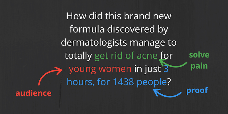
- How did this brand new formula manage to totally get rid of acne in just 3 hours?
- How to cook delicious food like chef Gordon Ramsay in 4 short weeks
To create the best headlines, here’s a formula you can use:
- Target audience
- Pain/problem you solve
- Proof (what makes you qualified to solve their pain)
2/ Matching headline
A common mistake people make is not matching the headline of the lead capture page to what was promised before people clicked to get to that page.
This results in poor visitor-to-lead conversion.
If you say you’re going to show people how to play the guitar better, then you better repeat that on the lead capture page, preferably in the headline.
This is especially true if you’re driving cold traffic to your page. These people don’t know who you are.
Using the lose weight example, this is what you should be doing:
Ad:
How you can lose 10 pounds in 14 days without going on a diet
Headline on lead capture page:
How you can lose 10 pounds in 14 days without going on a diet
The ad and headline don’t have to be always 100% identical in the usage of words, but they better be very similar and congruent.
Some time ago I ran an ad:
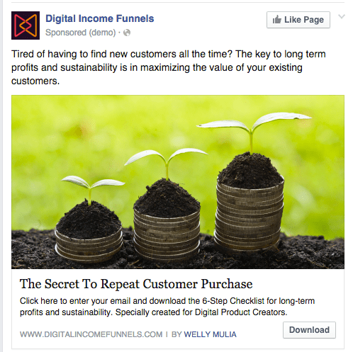
This is where people go to when they clicked:
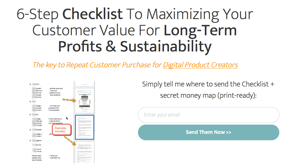
The ad is very congruent to the landing page content.
My ad copy says “click here and enter your email to download”. People who clicked already know they have to enter their email to download… which means the opt-in conversion is going to be good. Those who don’t want to enter their email won’t click.
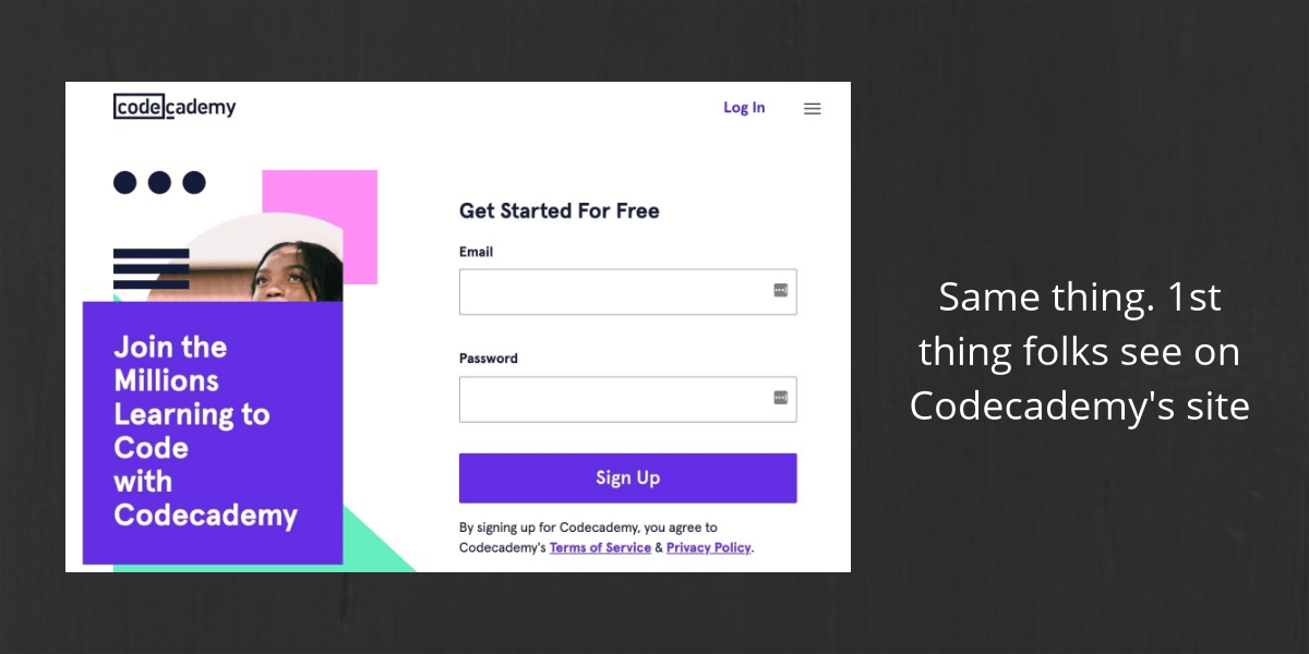
3/ Above the fold
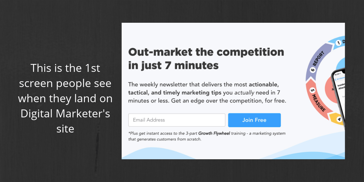
Make your headline and opt-in form above the fold.
This is the 1st screen people see without having to scroll down. Prime real estate. Remember 80% see this.
And only 20% scroll down to the rest of your content.
4/ WIIFM
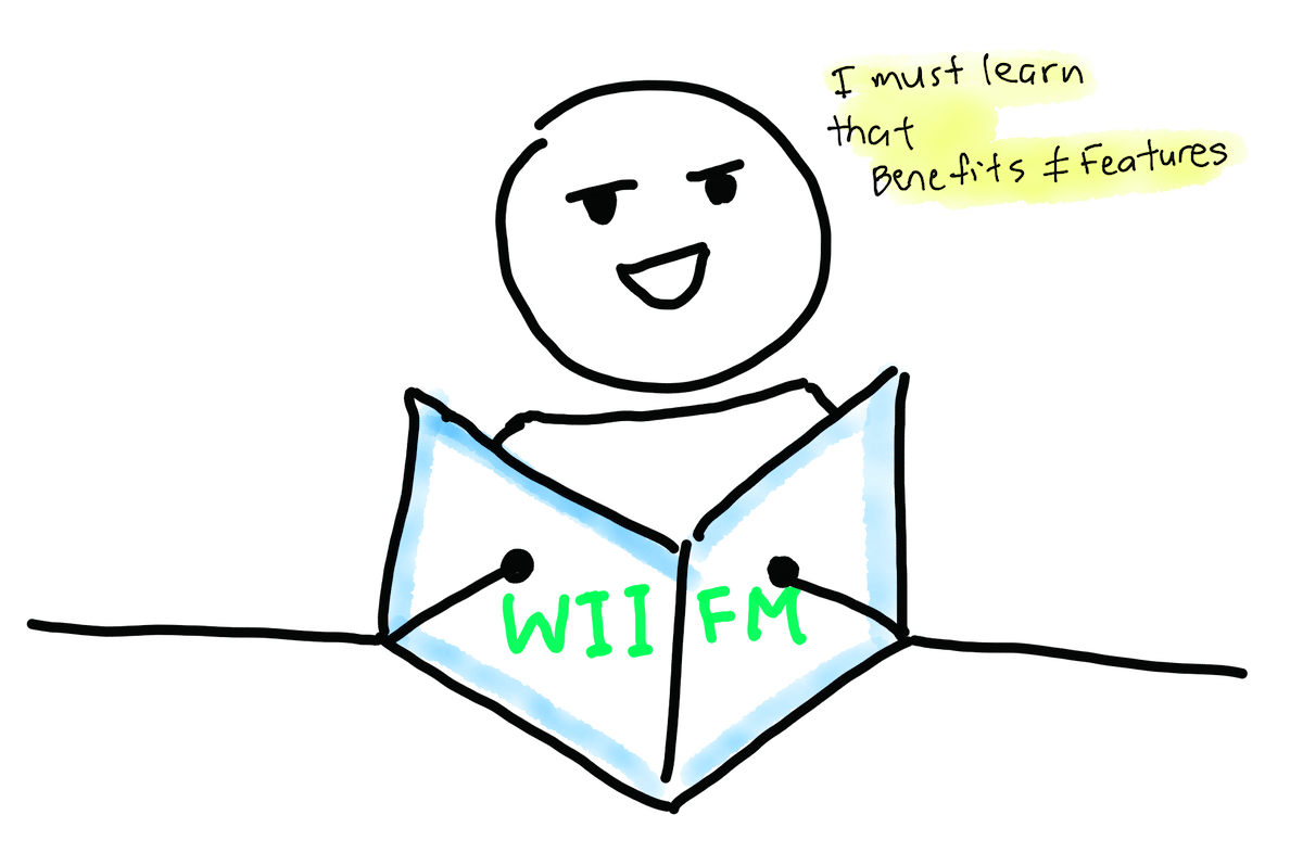
Instead of just telling features, you need to tell EXACTLY how those features can benefit your target audience.
Will they make people’s lives easier? How much time and money would they save? Would they become healthier? What’s in it for me (WIIFM)?
E.g. 1
Features:

Do you even understand what it means?
Below are WIIFM/benefits that the average person can understand:
Our multiple steps of purification and filtration system remove 99% of all impurities and contaminants. Many consumers drinking O2 Aqua have seen tremendous health improvements over the years.
E.g. 2
What about HDD and SSD when talking about computers?
When you say an SSD can write up to 654 MB/s or read up to 712 MB/s, while HDD can write up to 85 MB/s or read up to 87 MB/s… these don’t provide much context to the average computer user.
The difference between HDD and SSD basically comes down to speed.
A much better way to show the difference is to put it into context. With SSD the average boot time is 10 – 13 seconds while the HDD takes 30 – 40 seconds
5/ Bullets
Everyone and his dog is competing for the attention of your audience, and their brain has to filter out information to keep themselves sane.
They’ll only pay attention to folks who are interesting. The question is: “Will you be one of these folks?”
People scan your content. They don’t read word for word. Nielsen Norman’s research shows people read in an F-shaped pattern.
Translate this to your lead capture page, and it means:
Your headline is the first thing they read.
Then they read somewhere in the middle — which is the perfect place to use bullet points.
Your copy should cover just enough to make people want to opt-in to get your lead magnet. This means your copy should be short and concise.
E.g. Terry Dean’s lead capture page
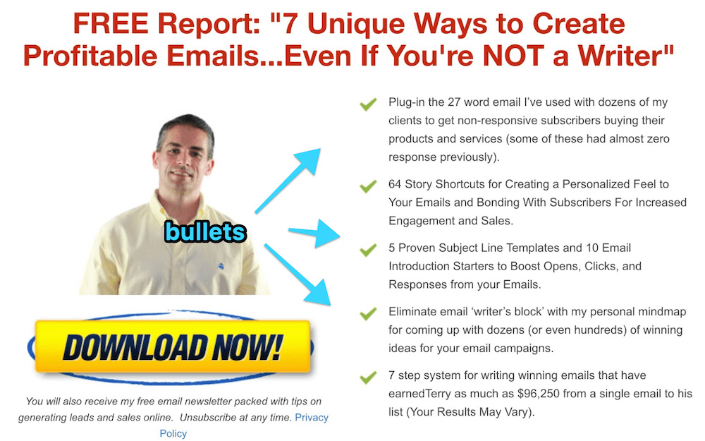
(interestingly, Terry put his face and big download button on the left side, probably wanting people to pay attention to the button)
6/ Trust elements
These elements increase trust and boost your conversions:
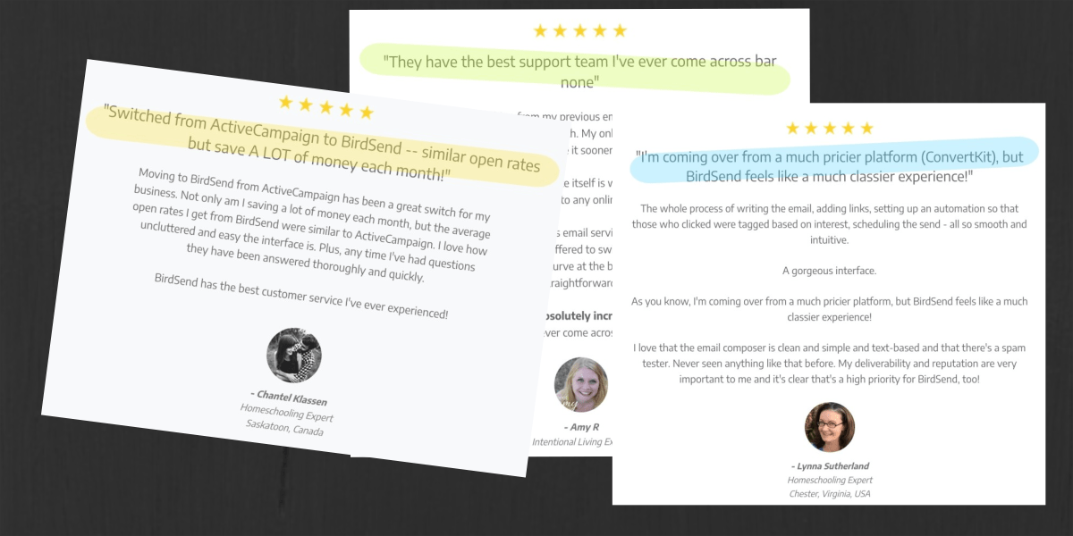
- Customer testimonials
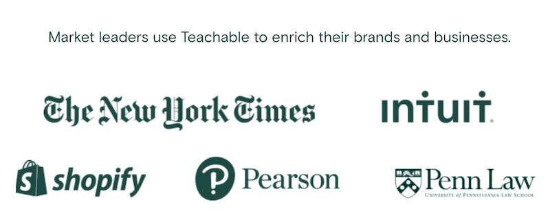
- Customer logos
- Media coverage/mentions (TV, radio, newspaper, magazine, online outlets)
Eg. Teachable showcases this on their site:
E.g. ehm ehm if you’ll excuse me tooting my own horn, BirdSend displays tons of customer reviews:
7/ Irresistible CTA
After folks have read your headline and bullets, they’re excited to get your lead magnet.
Show them exactly what they need to do next. Now is where you present your prominent and enticing CTA button.
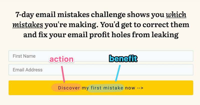
Don’t just say “Sign up” because you know sign up is b o r i n g 🥱
Use benefit + action words in your CTA button.
TLDR
Do these 7 things to boost the number of people signing up for your email list:
- Great headline
- Headline matches what was clicked
- Above the fold
- Use benefits (not features)
- Use bullet points
- Showcase trust elements
- Irresistible CTA
I cover 7 more tips to increase your opt-in rates here.
Special thanks to Copyblogger and Nielsen Norman Group for the research and stats.
