
CTA = Call To Action = what you want subscribers to do = your goal
It could be asking them to:
- check out your latest blog post
- watch your latest video
- buy your brand new course
- try out your new service for free
- asking for constructive feedback/testimonials
No CTA = No goal!
Here are 6 tips to create compelling email CTAs.
1/ Contrast button
A button is visual — it stands out from the sea of text in your email.
But not just any button. You want an instantly eye-catching button — i.e. it should contrast with your background.
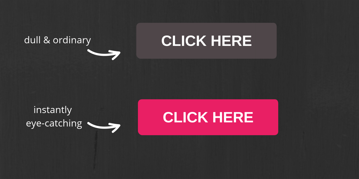
Campaign Monitor found using a button instead of a link boosted their click-throughs by 28%.
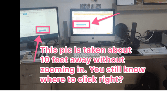
Can you step 10 feet away from your computer and people still know where to click?
2/ One goal
There should only be one goal with every email you send. No more. No less.
Having many goals means asking subscribers to do many different things.
Do you want me to check out your new video? Or follow you on Facebook? Or buy your brand new course?
Confused = no clicks = no goal.
With only one goal — e.g. to buy your brand new course — it’s very clear what they should do — they should click the link to go to check out the course.
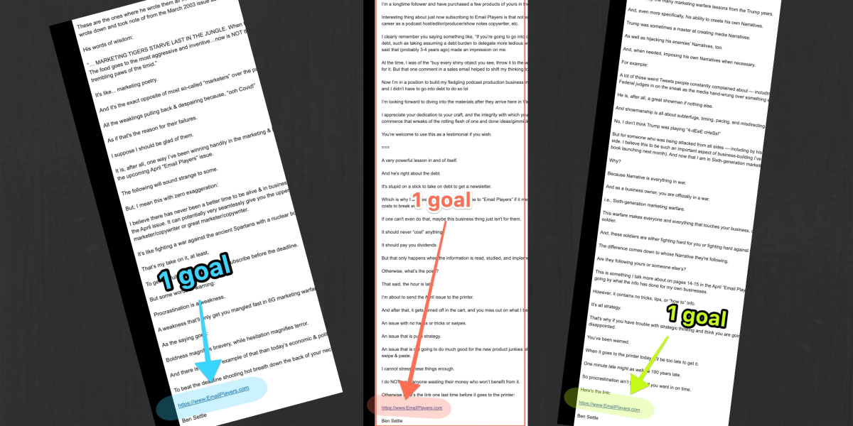
E.g. Ben Settle’s emails promote only 1 thing:

3/ Repeat the same “goal” CTA multiple times
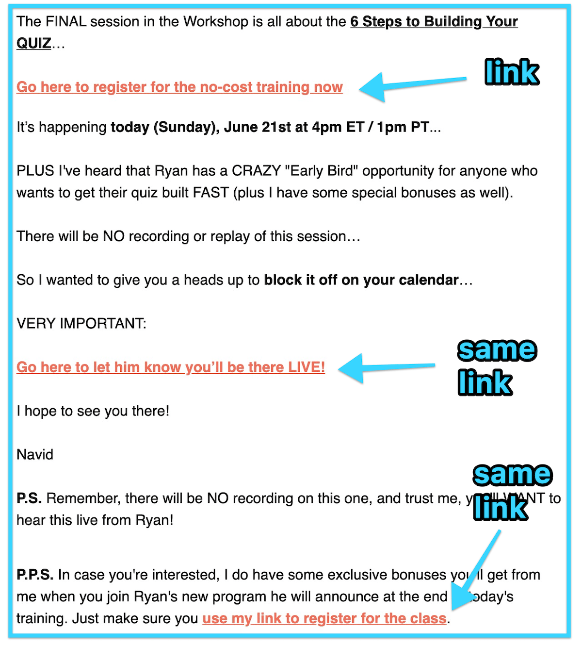
You can repeat the same “goal” CTA multiple times inside an email, as long as the objective of the CTA stays the same.
So near the beginning of the email body, you could have this CTA text:
See how this course can help you ace your next maths exam
Then in the middle, you can have another CTA text:
Claim your free trial of “Math Super Powers” now
And near the end or in the P.S you could throw in another CTA button.
Mix and match text and buttons to create variety.
Here’s Navid Moazzez’s email promoting the same link multiple times:
4/ Enticing CTA text
“Click here” or “check this out” is boring and lame.
Use a more persuasive text.
E.g,
How to become a pro novelist like John Grisham
Improve your memory in just 7 days
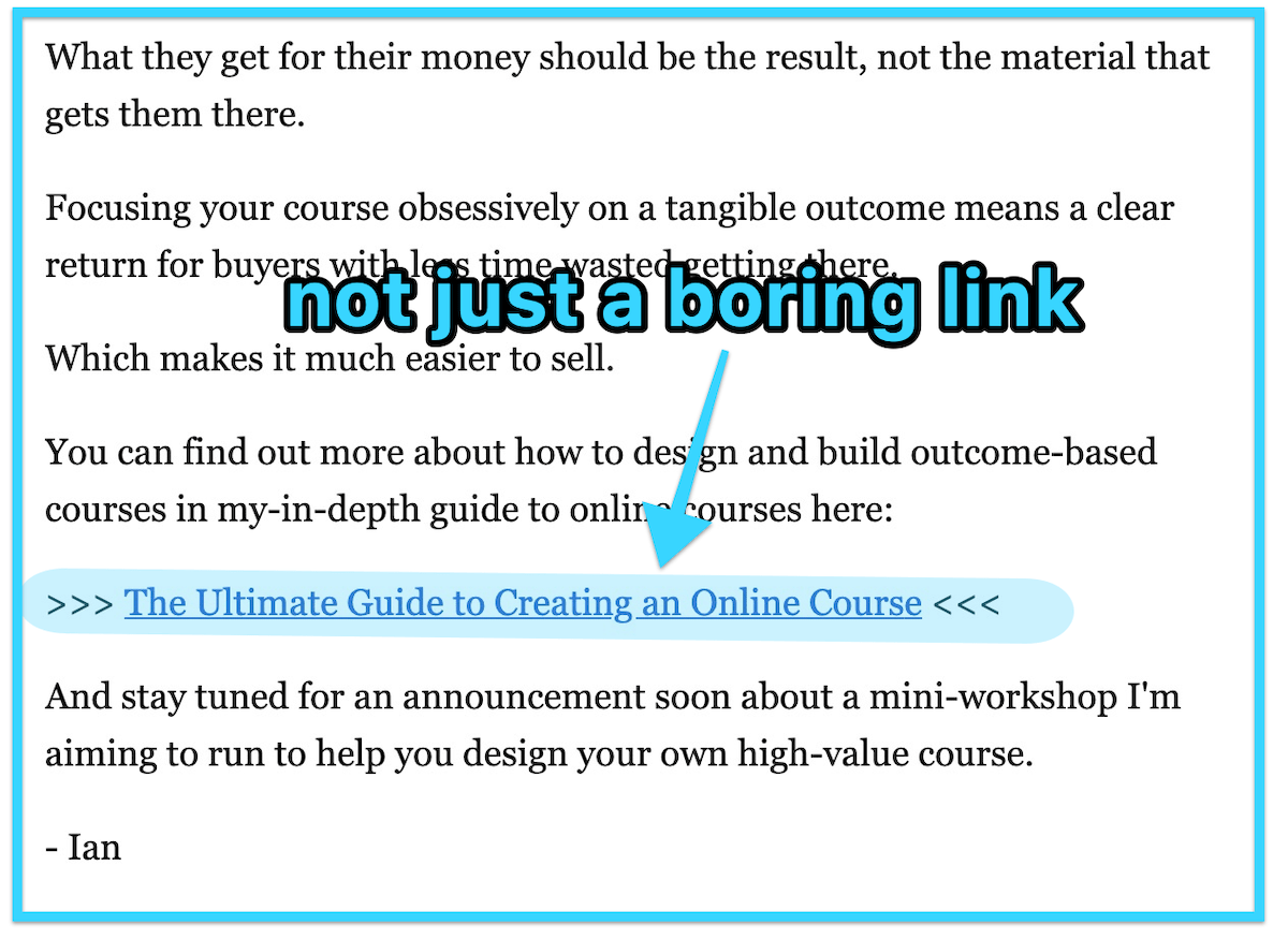
See how Ian Brodie does it:
5/ Make the CTA into a separate line on its own
Instead of having the CTA text in the middle or end of a sentence, make it into a separate line on its own.
When readers scan (not read) your email content, the CTA becomes more visible.
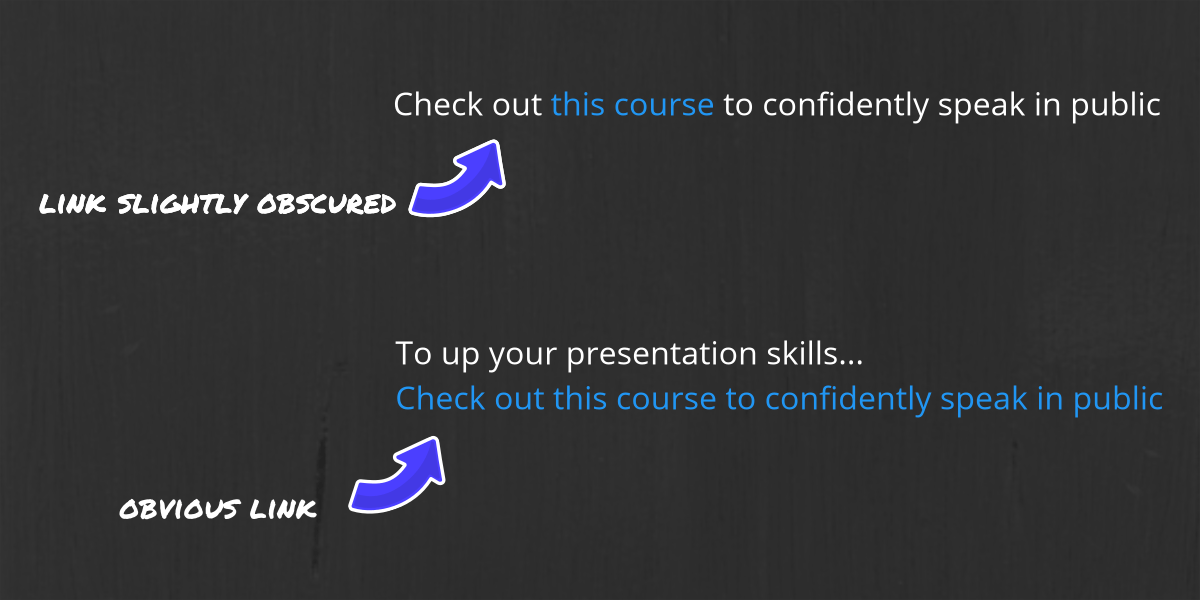
To create variety, don’t do this for every single CTA. For example, if you have 2 CTA texts in your email… you could have one in the middle of a sentence and another one in a separate line.
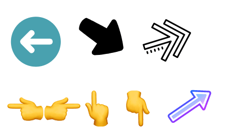
6/ Use visual cues
Visual cues like arrows and hand-pointing emojis help direct the eyes of the reader. Use these to direct their eyes and attention to your CTA.
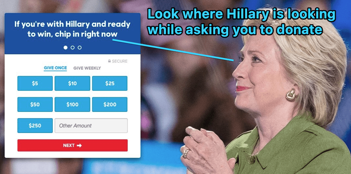
Or you could insert an image of someone looking at the direction of your CTA, like this:

When people see this, they’ll think “what’s he looking at?” Then they try to put themselves in that person’s perspective. And look at whatever direction he is looking at… which, of course, is your CTA.
(tip: in the e.g. above, instead of only hyperlinking your button… try hyperlinking the whole image. This makes clicking your link easier).
Hillary is a very persuasive lady. When she wants people to donate, here’s how she’d do it:
TLDR
Do these to create compelling CTAs:
1/ Contrast button
2/ One goal for each email
3/ Multiple repeats of the same “goal” CTA
4/ Enticing CTA text
5/ Make the CTA into a separate line on its own
6/ Use visual cues
Special thanks to Campaign Monitor for the research and stats.