[thrive_text_block color=”note” headline=”Post Lead Conversion — Free Guide”]
After someone opts in to get your Freemium, what should you do next? Should you use single or double optin?
PLUS you get to get the pdf version of this blog post as well so that you can refer to it anytime you like, even when you’re offline.
Click here to get both FREE.
[/thrive_text_block]
This post is about how to create a squeeze page or lead capture page, but not just any kind of lead capture page, but one that is high converting.
Very recently, I ran a few Facebook ads (different targeting interests but the same ad) and I got 143 optins out of 225 link clicks.
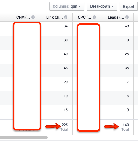
143 / 225 = 63.6% conversion
This is the ad (you may have seen it and got into my list):
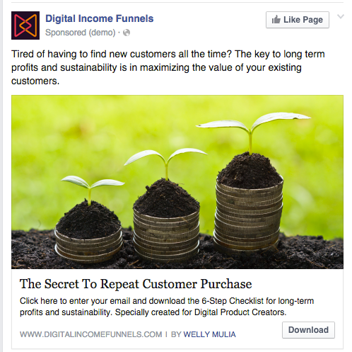
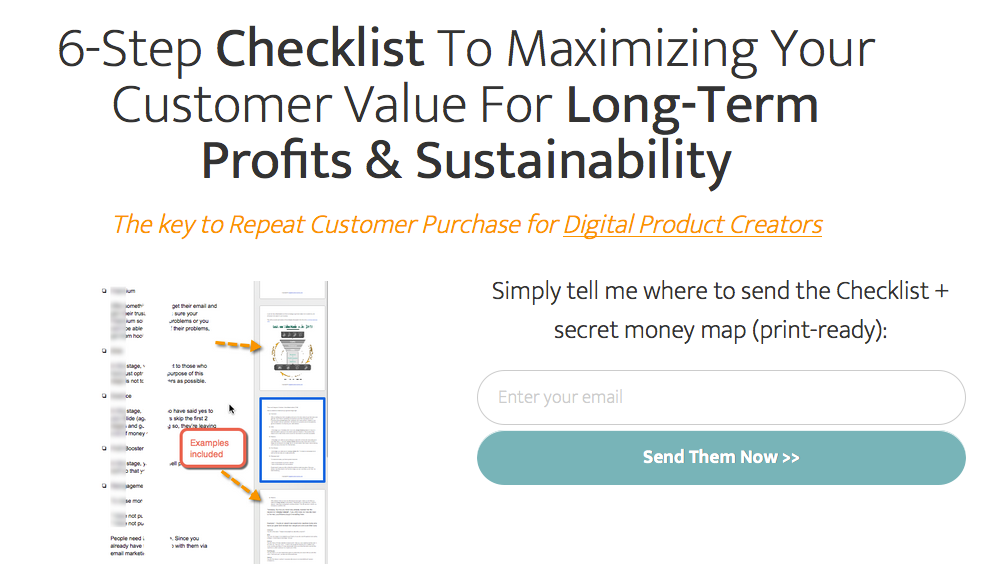
After people click on the ad, they’re directed to this lead capture page:
While I’d love to say: do XYZ and you’ll achieve the same results… the reality is that it’s not that straightforward.
Every business is unique in its own ways and you’ll probably not achieve 64% optin conversion, but even if you just get 40%, I’m sure it’s still a good number.
What I can do is to lay out the guidelines and strategies behind this, and how you can follow them and apply to your own business.
[thrive_text_block color=”note” headline=””]
After you’ve finished reading this post, you’ll be able to create your high converting lead capture page in 7 steps.
[/thrive_text_block]
Last post I showed you 4 steps to creating your irresistible Freemium / lead magnet.
Your Freemium MUST transition naturally to your Slide / Front end product, otherwise you won’t be able to convert leads to customers. Not even a single one.
Find A Hook For Your Freemium
A hook is basically a unique angle (that contains benefits and curiosity) to present your Freemium so that your target audience are “hooked” and desperately want to get their hands on it, no matter what.
You can’t just say “Get my ebook for free”. Even though it’s free, you still need to persuade and entice people.
Everyone is overwhelmed with information these days. What makes your Freemium any different than those that can be found with a simple Google search? You must make your Freemium stand out and increase its perceived value.
And a good way to do that is via your irresistible hook.
Using my ad example from earlier, my hook is “repeat customer purchase”. My Freemium is about sales funnels for digital product creators. But if I were to offer it point-blank: “Get my sales funnel for digital product creators for free” — I don’t think I would have achieved 64.6% in conversion.
There are tons of email marketing courses out there. What makes Terry Dean’s Autoresponder Alchemy course stand out?
He uses the hook “model my proven collection of million dollar emails” and include it in his headline. He gives you 80 of his real emails that have been sent to subscribers and customers and turned them into templates that anyone can use and fill-in-the-blanks.

Do Everything With 80/20 In Mind
Since we’re all limited with time and resources, we should do everything with 80/20 in mind — i.e. focusing the most important tasks that bring in the best results, and knowing and realizing that it’s okay to be imperfect.
I’ve also talked about how anyone can get more things done in less time in this post.
[thrive_text_block color=”blue” headline=””]
Do you want to increase your profits or do you want to achieve perfection?
[/thrive_text_block]
This means we’re not going to be talking about, for example, what color to use for the background of the lead capture page, or what color to use for the call to action button — as they return marginal improvement in conversions, at best.
The Most Significant Conversion Improvement
When talking about conversion, most would think of “copywriting”.
For those not sure what it means, copywriting basically means using the power of persuasive words to persuade, influence, and entice people to do whatever you want them to do.
Copywriting is very much over-hyped.
Read on below to find out why…
The most significant conversion improvement you’ll get is by focusing on AOC.
A = Audience
O = Offer
C = Copy / Copywriting
Wait a minute! Didn’t I just say that copywriting is way over-hyped?
Yes, it’s over-hyped because most make it the holy grail of getting good conversions… the be-all-end-all. Copy is important, but not that important.
You see:
Audience > Offer > Copy
This applies not only to lead capture pages, but to sales pages, emails, social media posts, and basically everything you do in your business.
The audience is the most important aspect. This is why step #1 in creating your Freemium / lead magnet is to understand who you’re creating it for.
Next is the offer, which in this case is your Freemium. If you’ve done the steps correctly as outlined in the previous post, you’ll no doubt have created an irresistible Freemium that your audience crave for.
Last is the copy. You can have the best copy done by the best copywriter in the world, but if you target the wrong audience with the wrong offer… puff! You’ll never sell even a single unit.
Your copy can be standard (just enough to get by), but if you target the right audience with the right offer at the right time, some will still buy/optin.
Remember, the job of the “copy” is to facilitate and increase the likelihood that people convert — but in order to do that, the audience and offer has to be right first.
[bctt tweet=”This is how you get the most significant conversion improvement for your lead capture page”]
Use Power Words
80/20 applies to EVERYTHING, both business and personal.
It applies to the use of words, too.
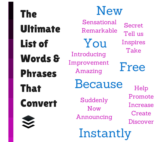
This post from Buffer shows these are the 5 most persuasive words:
You
Free
Because
Instantly
New
[thrive_text_block color=”note” headline=””]
The use of numbers in the middle of a sentence also makes that sentence stands out:
- How you can lose pounds in days without going on a diet
- How you can lose 10 pounds in 14 days without going on a diet
The first one is generic, the second is specific.
[/thrive_text_block]
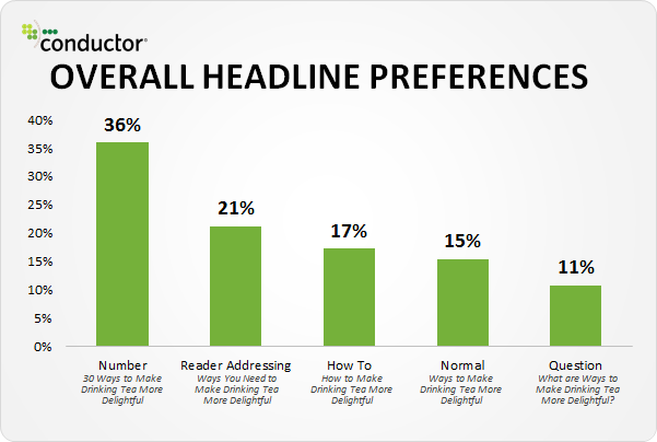
The use of numbers (as in the number itself instead of the number spelled-out) also makes a sentence stands out:
- How you can lose ten pounds in fourteen days without going on a diet
- How you can lose 10 pounds in 14 days without going on a diet
This is because numbers in a sentence are the odd ones out — and odd ones out are always attention-getters.
(image from Moz)
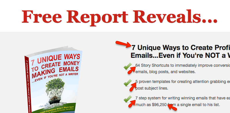
Terry Dean’s lead capture page also utilizes this technique:
Topic VS Headline
At first glance, topic and headline might look like they’re the same thing.
If you call yourself a marketer, then you definitely know they’re 2 different things.
Topics:
- How to lose weight fast
- Men dating tips
- Tips and tricks to getting rid of acne
- How to cook delicious food
Headlines:
- How you can lose 10 pounds in 14 days without going on a diet
- 5 practical steps to instantly get ANY lady you want (including those who are married) without a single rejection, ever
- How did this brand new formula discovered by dermatologists manage to totally get rid of acne in just 3 hours, for 1438 people?
- How to cook delicious food like chef Gordon Ramsay in 4 short weeks
Can you spot the difference?
Topics are general, while headlines are specific.
Take a look at the optin form on Groove’s blog:
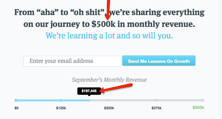
When creating your headline, the more specific you get… the more credible it becomes and the higher the conversion.
Headlines are very important because it’s the very first thing people see when they land on your page. According to Copyblogger, on average 8 out of 10 people will read the headline, but only 2 of out 10 will read the rest of your content.
The headline is the determining factor whether people want to to continue reading the rest of your content or not.
Headline That Matches What Was Clicked

A common mistake marketers make is not matching the headline of the lead capture page to what was promised before people clicked to get to that page.
The consequence of this is poor visitor-to-lead conversion, which in turn leads to increased costs.
Whether you’re running ads or sending emails, if you say you’re going to show people how to play the guitar better, then you better fulfill on your promise on the landing page — especially the headline.
This is especially true for ads because you’re driving cold traffic to your lead capture page. These people haven’t had prior contact with you. They don’t know who you are. Be sure to match what your ad says and what your headline says.
Using the lose weight example, this is what you should be doing:
Ad:
How you can lose 10 pounds in 14 days without going on a diet
Headline on lead capture page:
How you can lose 10 pounds in 14 days without going on a diet
[thrive_text_block color=”blue” headline=”Note About Ads”]
Many advertising platforms are very strict nowadays regarding promising to achieve a certain result. When claiming a result like this, always be sure you can substantiate your claim… if not you’ll jeopardize your account. I’m simply using the above as an example.
[/thrive_text_block]
The ad and headline doesn’t have to be always 100% identical in the usage of words, but they better be very similar and congruent.
Let’s revisit my ad again:

This is where people are taken when they clicked on it:

Notice the ad content is very congruent to the landing page content, especially the headline? This is no accident.
[thrive_text_block color=”note” headline=”*** TIP ***”]
In the example above, my ad copy says “click here and enter your email to download…”. This means people who clicked on the ad already know that they have to enter their email to download… which also means the conversion is going to be high. Those who don’t want to enter their email won’t click — which is good.
[/thrive_text_block]
Call Out Your Audience

Who are your audience? Don’t be shy to call them out.
This will disqualify people who are not interested in your topic, which is a good thing… since those who are not interested won’t buy anyway (however good your product or copy is).
You can then laser target your audience, or even better… your perfect customers.
They’ll think: “This person knows exactly what I want!”
You can call out your audience in your headline if space permits. If not, you can do so in your sub-headline.
My Facebook ad called out to “Digital Product Creators”.
On this blog, I also have lead-capture forms in place where I call out to Digital Product Creators:

Spell Out The Benefits
Instead of just telling the features, you need to tell EXACTLY what those features can do for your target audience as well. Will they make people’s lives easier? How much time and money would they save? Would they become healthier? What’s in it for the audience (not you the seller)?
From o2 Aqua’s site, this is what I call “features”:
[thrive_text_block color=”light” headline=”Features”]
Spring and other bottled waters can have total dissolved solid (T.D.S.) readings of 300 and higher parts per million (P.P.M.). Measuring T.D.S. is a standard procedure for testing impurities and the total amount of dissolved solids in water. O2 Aqua has 0 to 5 P.P.M.
[/thrive_text_block]
Do you even understand what all these mean?
These are the benefits that the average person can understand:
[thrive_text_block color=”teal” headline=”Benefits”]
Our multiple steps of purification and filtration system removes 99% of all impurities and contaminants. Many consumers drinking O2 Aqua have seen tremendous health improvements over the years; Also people with certain health conditions especially with kidneys stones, gall bladder issues, liver issues, arthritis, asthma, heart conditions, migraines etc., have felt increased energy and overall increased health after drinking our water for a prolonged period of time.
[/thrive_text_block]
What about HDD and SSD when we’re talking about computers?
[thrive_text_block color=”light” headline=”Features”]
When you say a SSD can write up to 654 MB/s or read up to 712 MB/s, while HDD can write up to 85 MB/s or read up to 87 MB/s… these don’t really provide much context to the average computer user.
[/thrive_text_block]
The difference between HDD and SSD basically comes down to speed, though there are other differences.
[thrive_text_block color=”teal” headline=”Benefits”]
A much better way to demonstrate the difference is to put it into context. With SSD the average boot time is 10 – 13 seconds while the HDD takes 30 – 40 seconds.
[/thrive_text_block]
The point is: You can tell your features, but more importantly, make sure to tell how those features can help your audience live better lives.
Create An Information Gap
The human brain does not like an information gap or cliffhanger, and we can should use this to our advantage to get more people to optin.
Movie trailers are absolute experts at this. How many times have you watched a movie trailer with a cliffhanger ending? Why does Batman and Superman end up fighting each other? Aren’t they supposed to be the good guys joining forces?
If you’ll pardon my analogy, it’s like you’re having intercourse with your spouse and just at the moment of climax, your 2-year old comes into your room and you have to stop everything.
That’s the kind of emotions we’re talking about. You crave for the ending, but to get to the ending, you have to get access to my Freemium, and to do that, you’d have to give me your email first.
When creating your lead capture page, take this into account and try to create emotions that lead to an information gap.
Let’s take an example from Digital Marketer:
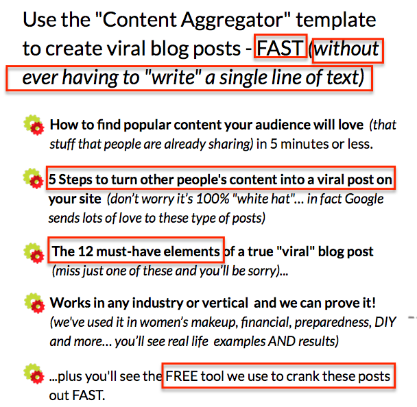
Notice they promise:
- Fast
- Without ever having to write a single line of text
- 5 steps to turn other people’s content into your own viral post (notice the numbers tactic I talked about earlier; also notice it says 5 steps without giving away what the 5 steps are — this is an information gap)
- 12 must-have elements (miss just one and you’ll be sorry) — but which one? This is also an information gap.
- A free tool to crank out posts fast — again, this is an information gap — you just have to know which free tool they’re talking about
[thrive_text_block color=”red” headline=” *** Post Lead Conversion — Free Guide ***”]
After someone opts in to get your Freemium, what should you do next? Should you use single or double optin? Click here to get the free guide.
(Notice I’m creating an information gap here — I’ve covered quite a lot about creating your lead capture page, but what happens after someone opted in? What should you do? Well, you just have to optin to find out :))
[/thrive_text_block]
Scanning Via Bullet Points
As stated earlier, everyone and his dog is competing for the attention of your audience, and your audience’s brain have to filter out information so as to keep themselves sane. Only those that are important and interesting to them will get their attention.
The question is: “Will you be one of the ones they’ll keep their attention on?”
Online, people are scanning your content. They’re not reading word by word. This article by Nielsen Norman Group shows that people read in an F-shaped pattern:
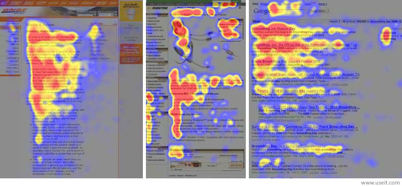
Translate this to your lead capture page, and it means:
- Your headline is the first thing they read (make sure they’re enticing and stand out than the rest of the text)
- Then they read somewhere in the middle — which is the perfect place to use bullet points
(If you’re scanning this post, at least you stopped at the bullet points did you?)
The Digital Marketer lead capture page I mentioned earlier uses bullet points as well.
So does Terry Dean’s page:

Also, since people scan for content, your copy should cover just enough to make people want to optin to get your Freemium. Most of the time, this means your copy should be short, concise, and to the point.
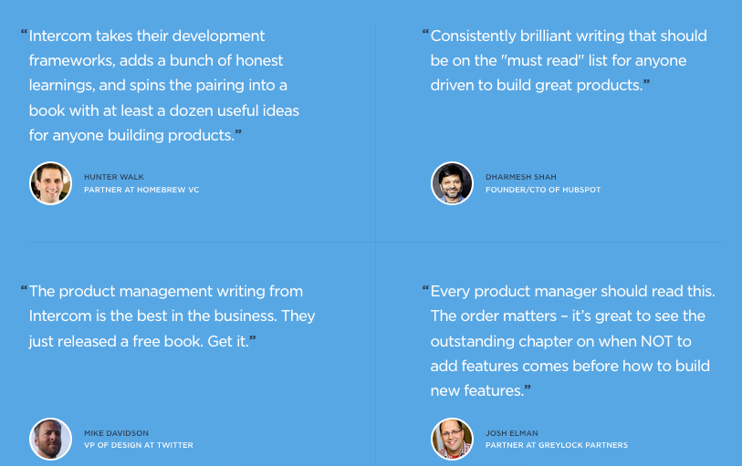
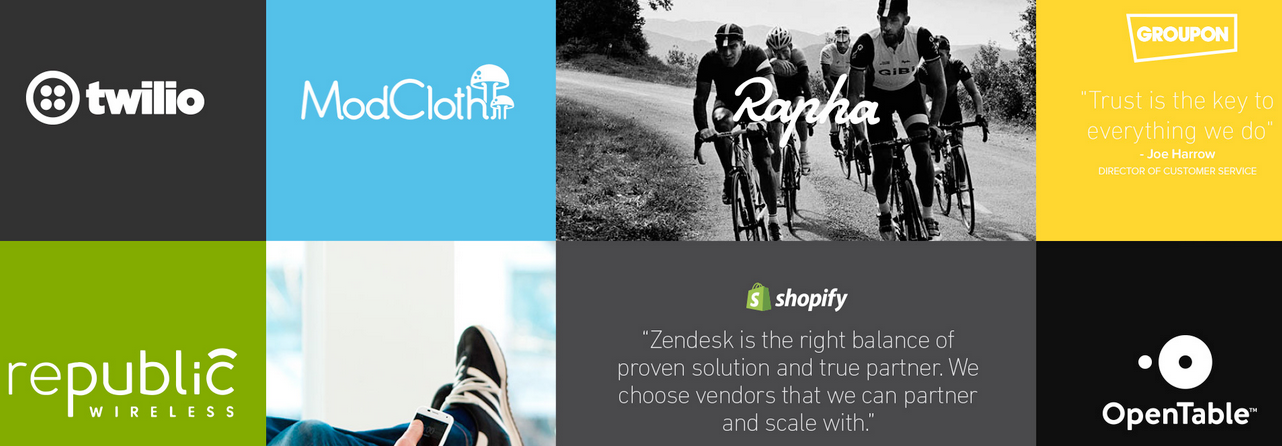
Use Trust Elements To Boost Conversions
These elements increase trust and will help with increasing your conversion:
- Customer testimonials
- Customer logos
- Media mentions (if you’re featured on TV, radio, or the newspaper, be sure to include their logos)
- Legal pages (privacy pages, terms of service, acceptable use policy, etc — these make you appear more legit)
[bctt tweet=”Use these trust elements on your lead capture page to achieve a 63.6% optin conversion”]
Here are a few examples.
Intercom.io on product management lead capture page:
Terry Dean’s lead capture page:


Zendesk.com:
Uservoice.com:

Email Only VS Name & Email
Next, you want to determine what info you want to ask visitors to fill out in order to get your Freemium / lead magnet.
Most digital product creators ask for name and email only.
The more info you require people to fill out, the lower your conversion but the higher quality that person is. If you make things more difficult to someone yet he still did what you ask him to do, chances are he’s very interested in your offer and is thus a higher quality lead.
The reverse is true — the less info people fill out, the higher your conversion but the lower the quality.
Unless you have a need to call your leads / subscribers by their names, you should ask for email only.
Use An Irresistible Call To Action
A common mistake is to ask people to join your newsletter. Nobody wants to join another newsletter.
Saying “Join our newsletter where we’ll provide you with the latest tips on how to do XYZ” will not motivate people to sign up. What EXACTLY will I get if I enter my email? Latest tip is vague. What latest tip are you talking about? Will it solve my problem now?
And please don’t use the word “Sign Up” on your call-to-action button either — again, no one wants to “sign up”.
You’d be much better to use action and benefit words like “Show Me How” or “Instant Access Now” or “Start My 6-Packs Transformation”.
Should You Use Video?
I would suggest not to use a video if you’re just starting out, because creating a video would take far longer time.
With video, you still have to create the hook/angle. You still need to write out the entire script. Then you’d have to practice multiple times, shoot the video and edit it.
Unless you’re already gaining momentum in your business, I would suggest again using 80/20 to skip video and focus on other more important areas. You can split test using video later on when you have enough traffic.
What About Ecover?
The same goes for ecover. If you’re a beginner, there’s no need to design an ecover for now.
Don’t overcomplicate. Use 80/20.
Remember AOC (Audience > Offer > Copy)?
If you get your audience and offer right, your copy can be ordinary and you have no ecover design for your Freemium… and you still will get leads.
Once you’ve gained traction and momentum and have collected your first 1000 leads, then you can go ahead and have an ecover created.
Creating The Lead Capture Page Itself & Email Service
The strategy and concept behind a high converting, irresistible lead capture page is the most most crucial part.
Once you understand the strategy, creating the lead capture page itself is the straightforward part, as we’re going to leverage the use of software tools to help us do that.
For lead capture and landing page creation, use one of these:
- WordPress + Thrive Landing Pages (aff) (self-hosted, lower cost, greater flexibility in design and layout)
- 1MinuteSites (no need to worry about hosting and installation, more expensive, less flexibility in design and layout)
For email autoresponder / sequence service to execute your email marketing campaigns:
- Zaxaa Ultimate Automation (yes, apart from shopping cart and sales funnel capabilities, Zaxaa can also send out sequence and broadcast emails based on tagging and smart automation)
How To Apply This To Your Business
Here’s how to create a squeeze page or lead capture page that’s irresistible and high converting in 7 steps:
- Plan and research according to the guidelines and strategies outlined in this post
- Write your headline (include elements of curiosity + benefits); Optionally, write your sub-headline (call out to specific audience)
- Write 3 – 4 bullet points (features + benefits)
- Make sure to leave an information gap (cliffhanger) that leaves the audience wanting for more
- Make sure your optin form / button is above the fold (i.e. when people land on your page, they can see the optin form / button immediately without having to scroll down).
- Put a 2nd optin form / button at the bottom of your page if your content spans past the above-the-fold area. This is to make the visitors’ lives easier by showing them the optin form right in their face once they’ve come to the end of your content, so that they can optin.
- Choose an action-benefit text to be put on the call-to-action (CTA) button.
After you’ve created your lead capture page and are ready to create your first paid product (Slide), make sure you follow these digital product creation guidelines.
Your Turn
What do you think about the guidelines and strategies I shared above? If you have any other tip to add that can increase optin conversion, please do share below so me and other readers can benefit and learn.
Feel free to post a link to your lead capture page as well, and invite others for feedback to improve it.
If you find this post useful, I’m sure others will as well. Can I ask a favor and ask you to share it with your friends by clicking one of the share buttons below? Thank you in advance!
[thrive_text_block color=”red” headline=” *** Post Lead Conversion — Free Guide ***”]
After someone opts in to get your Freemium, what should you do next? Should you use single or double optin?
(Notice I’m creating an information gap here — I’ve covered a lot about creating your lead capture page, but what happens after someone opted in? What should you do? Well, you just have to optin to find out :))
PLUS you get to get the pdf version of this blog post as well so that you can refer to it anytime you like, even when you’re offline.
Click here to get both FREE.
[/thrive_text_block]
