Introduction should go here.
But should there be one? Who doesn’t know higher opt-in rates = more subscribers?
1/ Dedicated lead capture page
On this page, you ONLY explain what your lead magnet is and how people are going to benefit from it.
Then you put an opt-in form. That’s it. There are no other content or links that distract people. The only thing they can do is either opt-in or close the page.
Some time ago, I ran a few Facebook ads and got 143 opt-ins out of 225 link clicks.
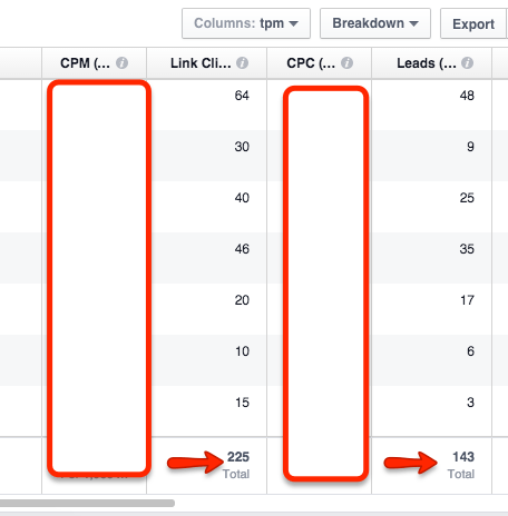
143 / 225 = 63.6% conversion
So how did I manage to achieve such a high opt-in conversion rate?
I sent them to a dedicated lead capture page instead of a blog post (where there are many distracting links and content).
To implement this, you need a lead magnet.
A lead magnet is a useful freebie you give away to entice people to opt-in to your list. It could be a pdf, video, template, checklist, etc.
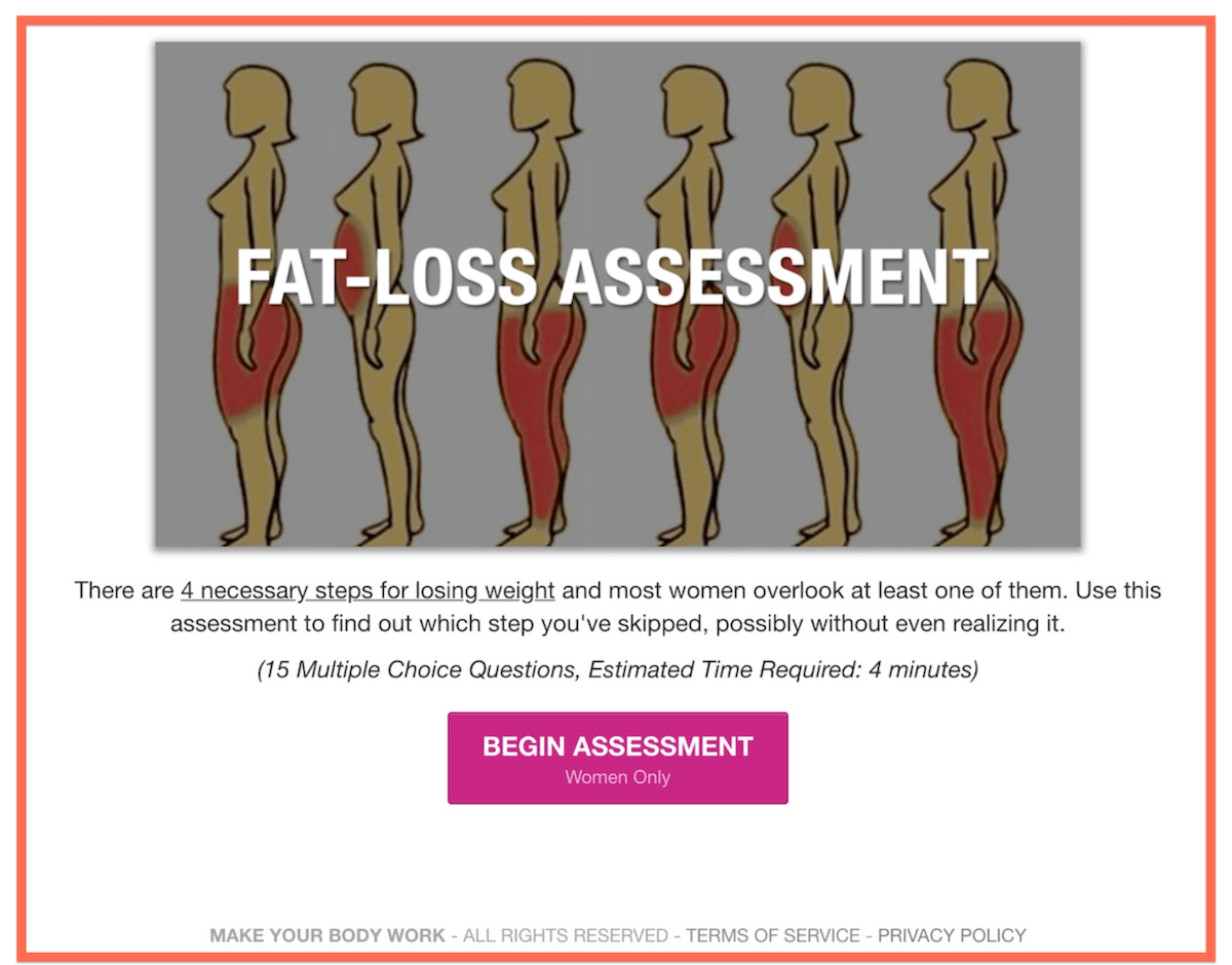
Another lead capture page example in the weight loss industry:
2/ The AOC equation
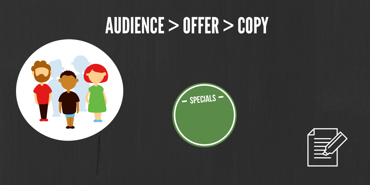
Audience (A) > Offer (O) > Copy (C)
Contrary to what you have heard, copy/copywriting is NOT king.
Target Audience is king. Next is the Offer (lead magnet). Last is the Copy.
Hence, the most significant conversion improvement you’ll get is by focusing on AOC.
You can have the best copy written by the best copywriter in the world, but if you target the wrong audience with the wrong offer, you’ll never sell anything.
Your copy can be standard (just enough to get by), but if you target the right audience with the right offer at the right time, some will still buy/opt-in.
Remember, the job of the copy is to facilitate and increase the likelihood that people convert — but to do that, the audience and offer have to be right first. There is no shortcut or magic.
When creating your lead capture page, make sure you understand who your target audience is. What problems are keeping them awake at night? After that you come up with a solution that solves their problems. Only then do you use your copywriting skills.
3/ Hook the reader early
A hook is a unique angle (that contains benefits and curiosity) so that your target audience is “hooked” or “hypnotized”.
“Get my free ebook” is boring 🥱
Everyone is overwhelmed with information. What makes your lead magnet different from those found via a simple Google search? You must make it stand out and increase its perceived value.
Via hooks.
E.g. 1
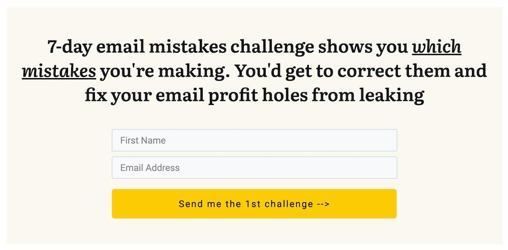
Most folks do email marketing the wrong way. So I dare them to an email challenge where they’ll discover the email mistakes they’re making, via daily emails. It’s not just another email marketing ebook.
E.g. 2
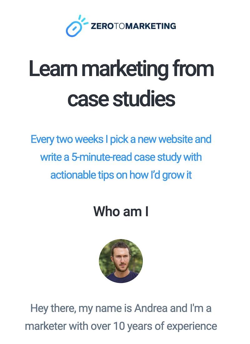
There are tons of email lists you can join about marketing. What makes Andrea Bosoni’s stand out?
- It’s not learning from theory. It’s learning from real case studies of real websites
- It’s only a 5-minute read every 2 weeks (he understands you’re busy and it implies his emails are easy and quick to digest)
4/ Newsletter sucks
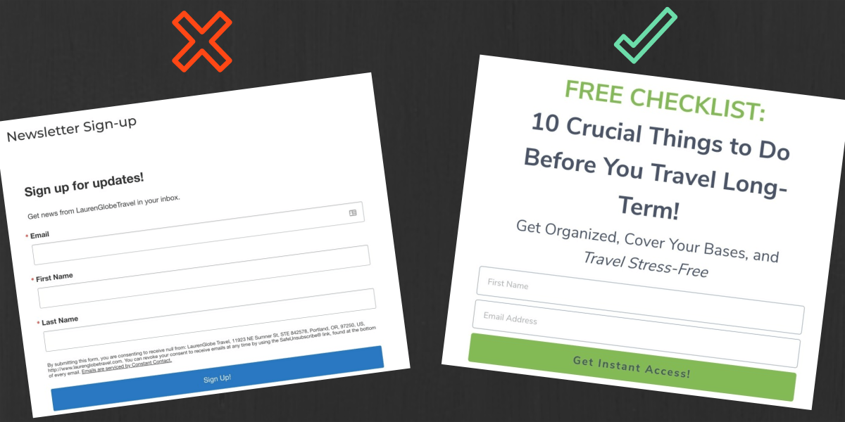
Nobody wants to join another newsletter.
They’re already subscribed to many.
Saying “Join our newsletter where we’ll provide you with the latest tips on X” will not motivate people to sign up. What EXACTLY will I get if I enter my email? Latest tip is vague. What latest tip are you talking about? Will it solve my problem now?
Provide immediate benefits that people can visualize right now. A good, old-fashioned short pdf or email series is more enticing. We call this “lead magnet”.
And please don’t use the word “Sign Up” on your call-to-action button — no one wants to “sign up”. Use action and benefit words instead.
E.g.
[Ace your next math exam]
[Start my 6 packs transformation]
[Make the perfect ice cream your kids love]
5/ Power words
Buffer shows these are the 5 most persuasive words:
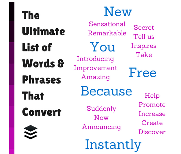
New – everyone wants to be the first to get something new
You — makes it all about the reader
Free — who doesn’t like free
Because — explain why they should get your lead magnet
Instantly — today, nobody wants to wait. Even if your site loads just a few seconds longer, people complain. Hence it’s important to promise instant benefits (e.g. challenge that shows you the mistakes you’re making and how to correct them).
6/ Use “3” Instead of “Three”
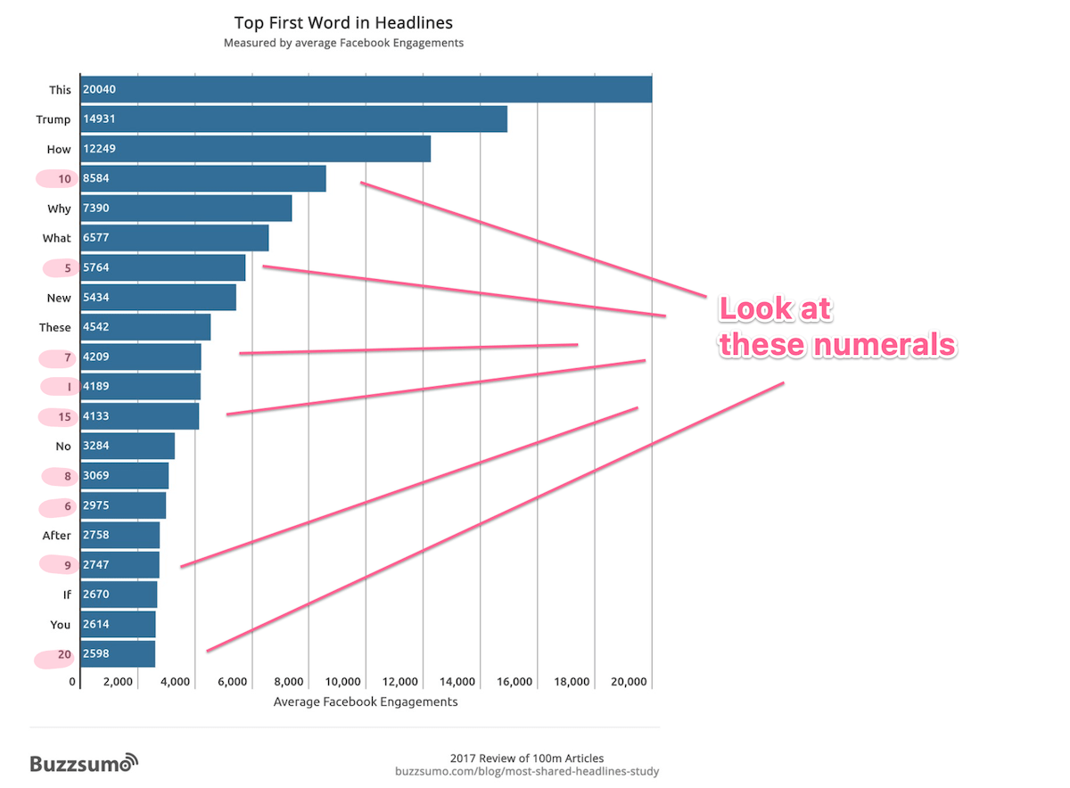
The use of numerals (instead of the number spelled out) makes a sentence stands out:
- How you can lose ten pounds in fourteen days without going on a diet VS
- How you can lose 10 pounds in 14 days without going on a diet
This is because numbers in a sentence are the odd ones out — and odd ones out are always attention-getters.
According to Nielsen Norman Group, “Numerals often stop the wandering eye and attract fixations…”
7/ Stop obsessing over stupid things 💩

Since we’re all limited with time and resources, we should do everything with 80/20 in mind — i.e. focusing on the most important tasks (above points) that bring in the best results. It’s okay to be imperfect.
Do you want to increase your profits or do you want to achieve perfection?
This means you shouldn’t be fussing over what color to use for the call-to-action button or whether it should have rounded corners — as they return marginal improvement in conversions, at best.
Just make sure the text is easy to read and the call-to-action is easily noticeable (eye-catching).
CXL — a marketing training company whose clients include Google, Cisco, and Ikea — found what matters most is that the button stands out, not the actual color used.
TLDR
7 tips to increase your opt-in conversion rate:
- Dedicated lead capture page
- Audience > Offer > Copy
- Use a hook
- Entice with a lead magnet that provides instant benefits instead of “newsletter”
- Use power words
- Use 5 instead of five
- Stop obsessing stupid things like what color to use
Wait there’s more…
I cover 7 more tips to boost your opt-in rate further.
Special thanks to Andrea Bosoni, Buffer, Nielsen Norman Group, Buzzsumo and CXL for the research, stats, and inspiration.
